CSS Gradient Generator — Free Visual Builder
Create beautiful CSS linear, radial, and conic gradients visually. Copy ready-to-use CSS code instantly. Free, no sign-up, works in your browser.
Create CSS Gradients Visually Without Writing Code
CSS gradients are one of the most powerful tools in a frontend developer's or designer's toolkit. They eliminate image HTTP requests for decorative backgrounds, enable smooth color transitions that adapt to any screen size, and can be animated and composited with other CSS effects. But writing gradient CSS by hand — especially for multi-stop gradients, precise angles, and radial or conic variants — is tedious and requires constant trial-and-error.
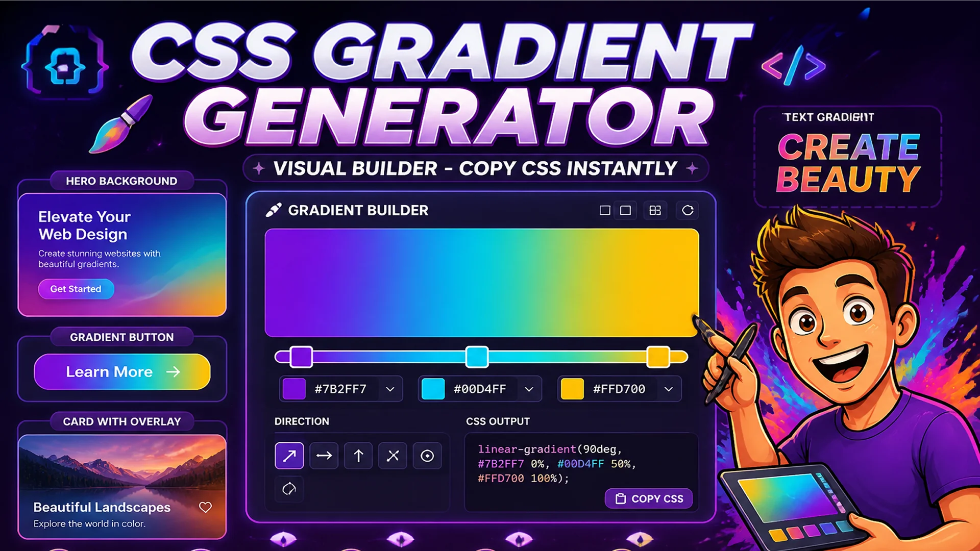
The Toolsnests CSS Gradient Generator provides a visual builder where you pick colors, drag color stops, adjust angles, and see the result in real time. When the gradient looks right, copy the CSS code with one click.
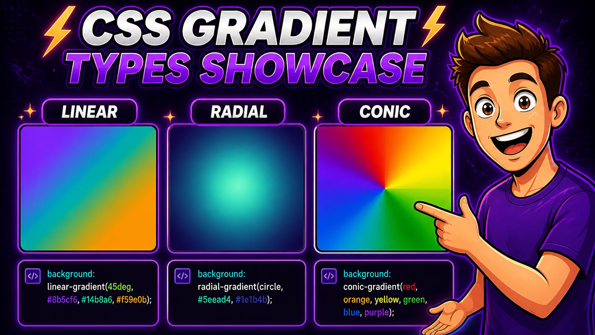
CSS Gradient Types: Linear, Radial, and Conic
Linear gradients (linear-gradient): transition colors along a straight line at any angle. 0deg is bottom-to-top, 90deg is left-to-right, 45deg is diagonal. Multiple color stops define where each color appears and how the transition progresses. Linear gradients are the most common type — used for button hover states, hero backgrounds, card overlays, and decorative dividers.
Radial gradients (radial-gradient): radiate outward from a central point in circular or elliptical patterns. Used for spotlight effects, circular badge backgrounds, and organic-looking color transitions. Conic gradients (conic-gradient): rotate around a center point, like a color wheel or pie chart. Used for progress indicators, pie chart visualizations, and decorative geometric patterns.
How to Generate a CSS Gradient on Toolsnests
Open the CSS Gradient Generator — no login, no installation.
Step 1: Select gradient type (linear, radial, or conic). Step 2: Add color stops — click the gradient bar to add a stop, click a stop to change its color using the color picker. Step 3: Drag stops along the gradient bar to position them. Step 4: For linear gradients, set the angle using the dial or type a degree value. Step 5: Preview the gradient on a sample layout. Step 6: Copy the CSS output — background, background-image, or the full property declaration.
Advanced Techniques: Multi-Stop and Transparent Gradients
Multi-stop gradients: add three, four, or more color stops to create complex gradients with multiple color transitions. A sunset gradient might use orange, pink, purple, and dark blue across five stops. Position stops precisely using percentage values — 0% at the left edge, 50% at the midpoint, 100% at the right edge.
Transparent gradients: use rgba colors with an alpha value of 0 for fully transparent stops. A common technique is a gradient from a solid color to transparent, used as an overlay on photographs to ensure text readability on variable image content. The Toolsnests generator supports full rgba color input including the alpha channel.
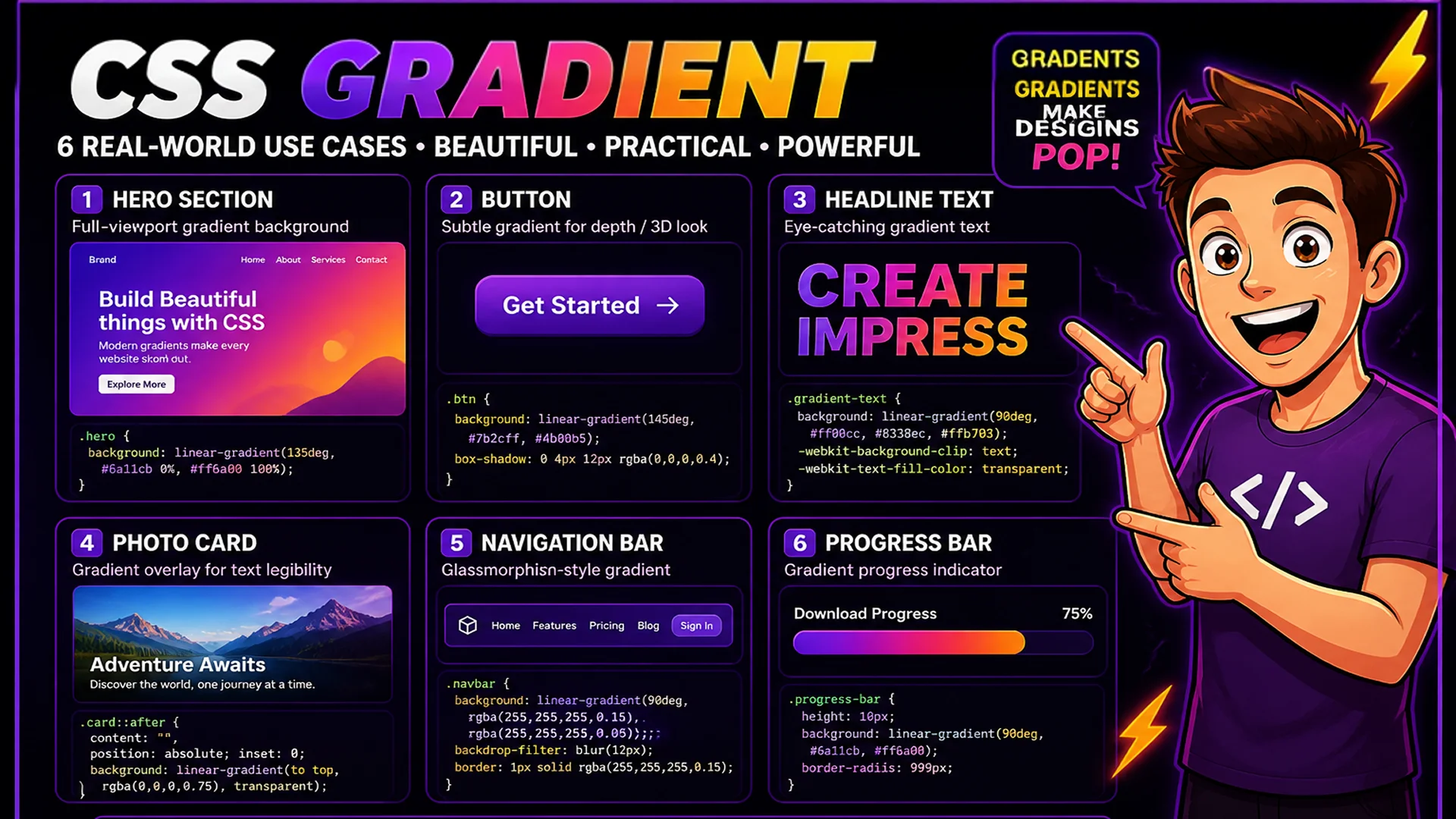
CSS Gradient Use Cases in Web Design
Hero section backgrounds: full-viewport linear gradients replace static background images with CSS-native color transitions that scale to any screen size and require zero HTTP requests. Button styles: subtle linear gradients on button backgrounds add depth and visual interest compared to flat solid colors. Card hover effects: transition background gradients using CSS transitions for smooth interactive effects. Text gradients: apply a gradient to text using background-clip: text and color: transparent for modern headline styling. Navigation overlays: dark-to-transparent gradient overlays on navigation bars ensure text legibility over scrolling content.
Related Design Tools
OKLCH Palette Generator — generate perceptually uniform color palettes for design systems. Color Generator — explore and generate color schemes for use in gradients. Favicon Generator — create favicon sets from gradient-background icons.
Final Thoughts
CSS gradients are one of the most visually impactful, performance-friendly styling tools in web development. A visual gradient builder eliminates the manual trial-and-error of writing gradient CSS by hand and makes it easy to explore color combinations that look great before committing to any specific direction.
Open the CSS Gradient Generator and build your next gradient visually — copy the ready-to-use CSS in seconds.